
comparison of inkWELL press planner of 2015/2016
- Andrea

- Dec 12, 2016
- 6 min read


Today I would like to give you my thoughts about the liveWELL planner of inkWELL press (IWP).
I have used the one for 2015 for (most) of the year, but I have switched to the X47 notebook with the set up of a bullet journal in about October 15, bullet journalling suits me now much better.
But nevertheless, I still ordered the planner of IWP for 2016 and I was lucky, I received one of IWPs second print run which Tonya of IWP sold in November. She is an amazing woman, having so many ideas about planning and organizing and she has a huge success with her planners.
The new planner of 2016 is slightly different to the one of 2015, so here are the differences between 2015 and 2016:
1. the size
the 2016 planner is slightly smaller than the one of 2015, not much, about 3cm in width and 1cm in height, which brings the planner down to about 21x23.5cm (incl wire binding), which is about 8x9.25 inches. The paper size is about 17.5x23cm (7x9 inches).


The bigger size of 2015 didn`t bother me much, for me it is a stay-at-home planner anyway, and I would not take the 2016 with me, even now with this smaller size.
Both plannes are wirebound and have an elastic band for closure.
Both have beautiful color options for their hard covers, this year I ordered the watercolor hexagon cover option, the color is a beautiful turquoise green with a hexagon pattern.
2. the colors of the month / tabs
When I opened up the planner to the very first page I saw a big difference in the color coding of the tabs. In 2016 the tabs are much more arranged by colors, 2015 seemed a bit random but still a somehow cyclic order of the same colors. There is more order in the sequence of the tabs this year.


What I actually don`t like in both planners: the colors of the tabs do not match the colors of the monthly layouts.
In 2015 the monthly colors were: yellow, pink, green and turquoise.
In 2016 they are: purple, apricot, turquoise and yellow:


but the tabs have different colors which do not even match the monthly colors, which I already found irritating in 2015 and again in 2016. The monthly colors themselves are very pretty, more so in 2015 than 2016, but still very nice. The colors are not as vibrant as you may know them in an Erin Condren planner, more muted but they look very elegant.
3. goal planning pages
Tonya is very much into list making and goal planning, I`m not :-), so I have not used these pages.
The goal pages of 2016 are more colorful than 2015 and now on two pages, and here the colors of the tabs appear. So having your planner open on these goal pages makes a very nice view of the page together with the tabs. These colors spread throughout the planner would have made a very nice overall picture (or the other way around, the colors of the month equal to the tabs), but I guess Tonya had a different color scheme in mind than I have.


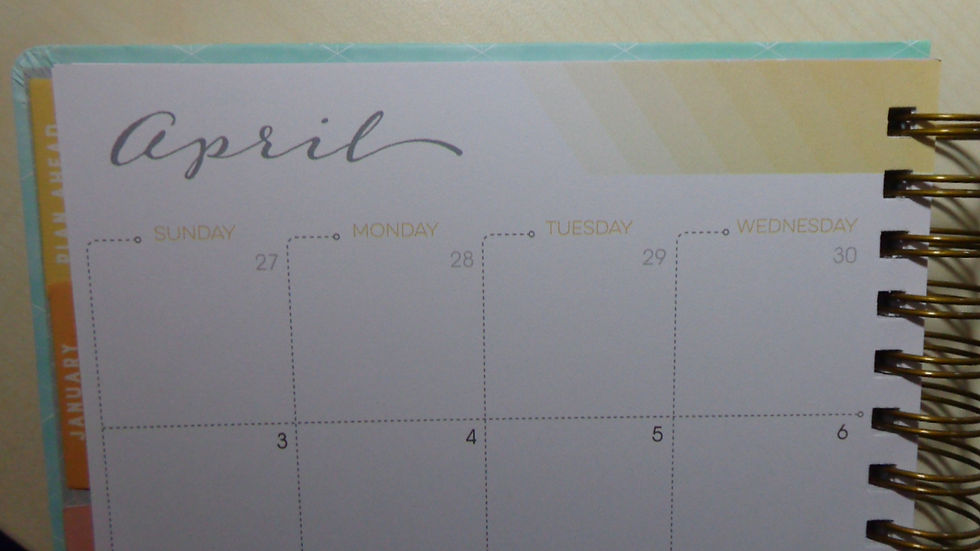
4. monthly overviews
the monthly overviews pretty much stayed the same, some different fonts, but still a note section on the right and a small overview of the next month in the right hand bottom corner. Maybe important to know for the readers in Europe: the weeks of these monthly overviews start with a Sunday and not with a Monday.


5. mission boards and notes
right after the monthly views there is one page with the mission board and one page for notes. This stayed pretty much the same as in the year before.
6. weekly layout
inkWELL press offers two weekly layouts for the overview of each week: classic or flex layout. Both options are the same as in the year before.


For me the flex layout works much better, I like to write whole sentences (and not just list points), the flex layout gives me much more space for that.
Due to the downsizing of the pages the colored fields on the right hand side are now a little bit smaller in width, while the whole space for the day stayed the same. The colored field is only about 5mm smaller, so really not that much.
There is no text anymore in the colored field, in 2015 the fields were named "meals, home or fitness", in 2016 you can name them yourself.
But: in 2015 there was still some white paper to be seen at the edge of the paper (see picture above with green fields), now in 2016 the colors go right to the edge of the paper which gives the page some kind of a "squashed" view. On the left page the holes of the binding run into the colored fields, not taking away any space but still, it looks a bit stuffed. The 2015 layout was much nicer to look at.
7. note pages
after each month you have two pages for notes, both in 2015 and 2016
8. fun stuff section - extra section
behind all months there is a section for "extras", which was called "fun stuff" in 2015
Both have a gift list, trip details list, a book/movie list or (new) in 2016 a monthly bill tracker.
The pages have a very strict layout, so either they work perfectly for you or you are struggling with them, because either you would like to write down more or, on the other hand, less of something. I did not really use them in 2015.
9. note pages
both planners have a section with squared note pages at the end
10. pouches
at the very end both planners have a double sided pocket folder and an accordion pocket. The accordion pocket had a little cord to securely close it in 2015, that cord does not exist anymore in 2016, but I think it wasn`t really needed.
Now to the very last point: the paper!
I`m a little bit picky about the paper of a planner, it must be thick, I don`t like bleed through of any ink and the paper must be smooth for easy writing.
I really really love the paper of 2015, this is such a luxurious paper, thick, smooth, heavenly to write on. When you glide over the paper with your fingertips it is just heaven, so smooth!
In 2016 this changed a little bit, you might call me paranoid but the paper is not as smooth anymore! Which I personally find very disappointing! Don`t get me wrong, the paper has the same thickness (140gsm), so there is no bleed through at all with fountain pens but it does not have that luxurious feeling anymore. The old paper was nearly glowing when light fell in a certain angle on it, the new paper is a little bit dull.
Writing about all the pros and cons and difference gets me now to the end conclusion: it is still a very nice and beautiful planner!
With all the information which you get on Tonya`s webpage and by email once you have ordered a planner, it is really worth it`s money (and yes, it is not a cheap one!).
And if you don`t have last year`s to compare with, you cannot have any complaints! So I guess I shouldn`t compare them but then I would not have anything to write about :-)
As I will not use the IWP planner of 2016 I have decided to make a RAFFLE and give it away as a Christmas present!
The only thing: you can only participate if you have a shipping adress and are living in Europe!!
I know that Tonya does not ship to oversea and that it is very expensive to get the hands on such a planner if you are living here in Europe. Plus, they are already sold out for 2016.
So here is your chance:
Go ahead with this LINK, enter your name and email adress, answer the question and I will draw the winner one day after the raffle ends. I will send out the planner totally free of charge to the winner.
Please read the terms of participation of this raffle at time of participating.
Everyone taking part with an adress outside of Europe will disqualify as a winner so please do not take part if you are not from Europe and leave open the chances for the ones here in Europe.
==> UPDATE: the raffle is closed now, thanks for participating!
I hope you have enjoyed reading about the inkWELL press planner, I wish you luck for the raffle!!
click on any hashtag to find related posts: #paperplanner #blogpost1


Comments